The whole week on one screen
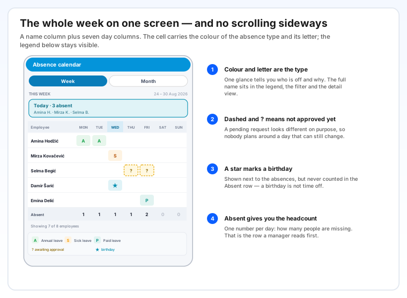
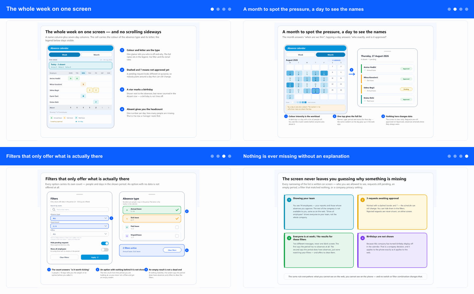
The default view is a week: a name column plus seven day columns, sized so nothing scrolls sideways on a phone. Each cell carries the colour of the absence type and its letter; the legend at the bottom stays visible, so you never have to remember what a colour meant.
Above the grid sits a short Today summary — how many people are away right now and who they are. Below it, the Absent row gives one number per day: how many people are missing. In practice that row is the one people read first.
A request that has not been approved yet looks different on purpose — a dashed border and a ? — so nobody plans around a day that can still change. A rejected request is never shown at all. And a star marks a birthday: it sits next to the absences but is never counted as one.
When several things fall on the same person and the same day, the cell shows the first and marks that there is more; tapping it opens the full list. Nothing is quietly dropped.
A month to spot the pressure, a day to see the names
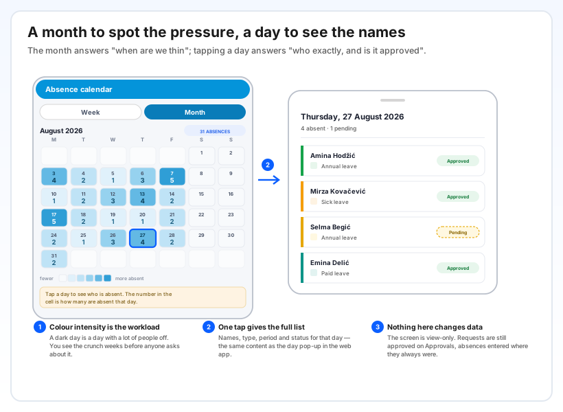
Switch to Month and each day becomes a single number — how many people are away — with stronger colour on the busier days. That turns a month into a shape you can read at a glance: the thin weeks stand out before anyone raises them in a meeting.
Tap any day and you get the names: who is absent, what type, for how long, and whether it is approved or still pending. It is the same content as the day pop-up in the web app.
Switching between week and month keeps your filters, so you can narrow to one department and then move through the periods without setting it up again.
Filters that only offer what is actually there
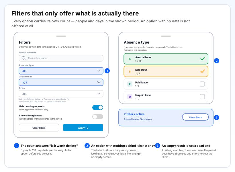
Filter by name, absence type, department, office and job role — plus team, for companies that work with teams. Every option carries its own count: people and days in the period you are looking at, so you know the weight of a choice before you make it.
The important part is what the list leaves out: an option with no data in that period is not offered at all. You cannot tick a filter and land on an empty screen because that combination never existed.
Two switches sit below: Hide pending requests, when you only want what is confirmed, and Show all employees, when you want the people with no absence to keep their row rather than disappear. Above the calendar, a line always states how many filters are active and which, with a one-tap way to clear them.
Nothing is ever missing without an explanation
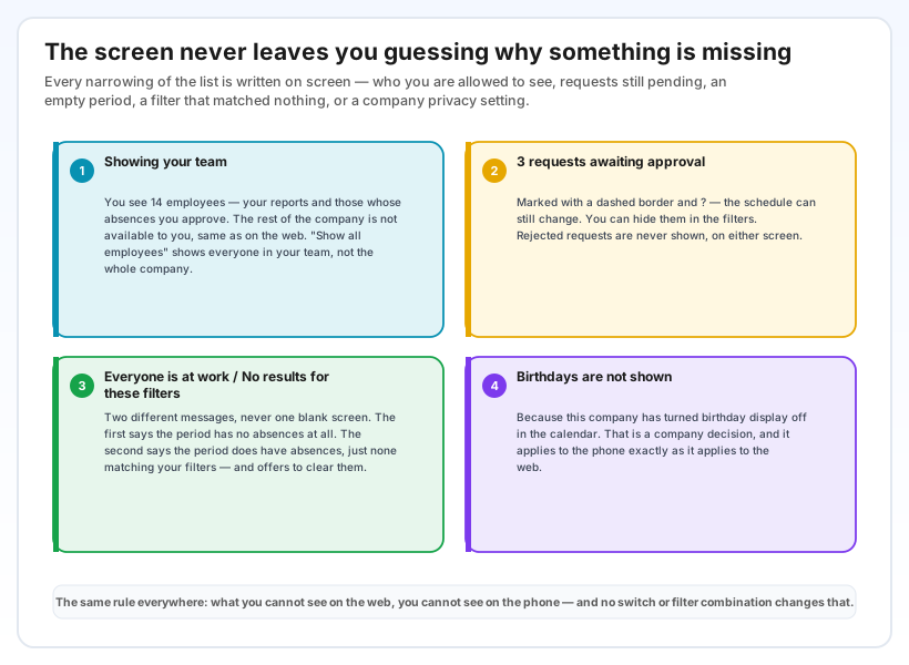
A calendar that silently shows less than the truth is worse than no calendar. So every reason the list is narrowed is written on the screen.
If your account only covers your own people, a banner says so and names the number — and it is explicit that Show all employees means everyone in your scope, not the whole company. You always see "Showing 7 of 8" when the list is shorter than the company. An empty period and an empty filter result are two different messages, never one blank screen. And when birthdays are switched off for your company, the screen says that too, instead of just leaving them out.
The underlying rule is simple and it does not bend: what you cannot see on the web, you cannot see on the phone. No switch and no filter combination widens that.
Why it helps
The answer arrives in seconds, wherever you are. On a site, in a car park, between meetings — you check who is away before you promise a date, not after.
Pending requests are visible as pending. You can tell the difference between "she is off" and "she has asked to be off", which is exactly the distinction that goes wrong when planning happens over the phone.
The month shows the crunch early. Overlapping leave in the same week is visible as a dark column long before it becomes a staffing problem.
One calendar, two screens. The phone and the web read the same records with the same rules — nothing to reconcile, and no second version of the truth.