The same screen, with the missing half filled in
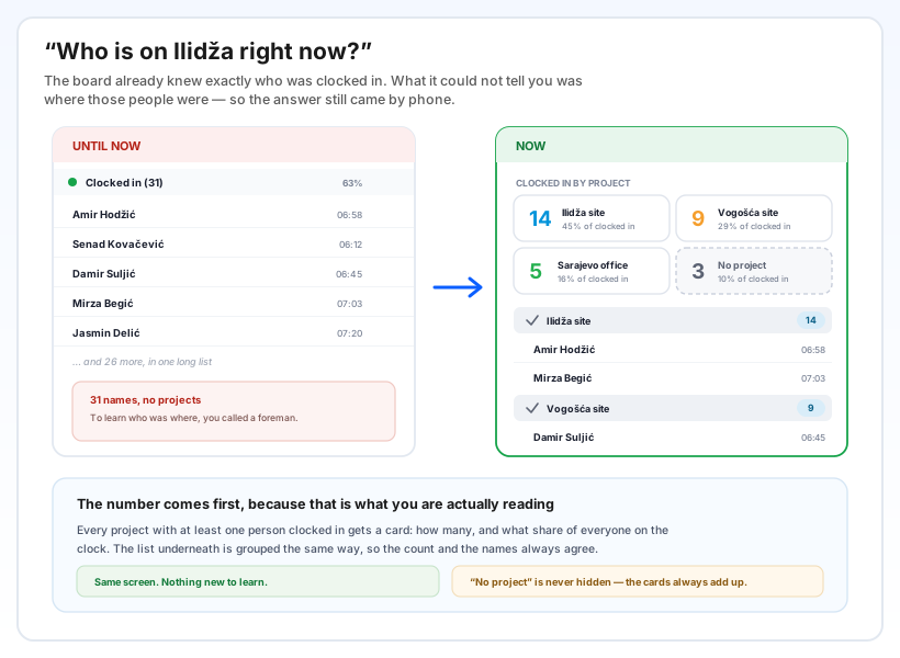
The board of people currently clocked in has always been accurate about who. It simply had nothing to say about where — so the daily question of who is on which site was still answered by calling a foreman.
Now every project with at least one person clocked in gets its own card: the headcount first and large, the name beside it, and the share of everyone currently on the clock. Underneath, the list of people is grouped the same way, so the number on the card and the names below it always agree.
People who clocked in without a project are collected under No project. That card is always shown, deliberately — if it were hidden, the cards would stop adding up to the total and the screen would quietly stop being trustworthy.
One click to focus, two shapes of the same list
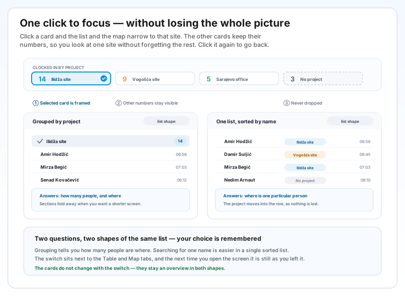
Click a card and the list and the map narrow to that project. Click the same card again and the filter is gone. The other cards keep their numbers throughout — you look closely at one project without losing sight of the rest. There is also a project filter in the filter bar, offering only the projects that actually have someone on them right now, each with its count.
Next to the Table and Map tabs there is a small switch between By project and By name. Grouping answers how many people are where; a single list sorted by name answers where is this one person. In the by-name view the project moves into each row, so nothing is lost by switching. Your choice is remembered for the next time you open the screen.
One column stays as it was on purpose: Not clocked in is neither grouped nor filtered by project, and the screen says so. Somebody who is not clocked in is not clocked in anywhere, so they have no project — grouping them would mean inventing information.
What it changes on an ordinary morning
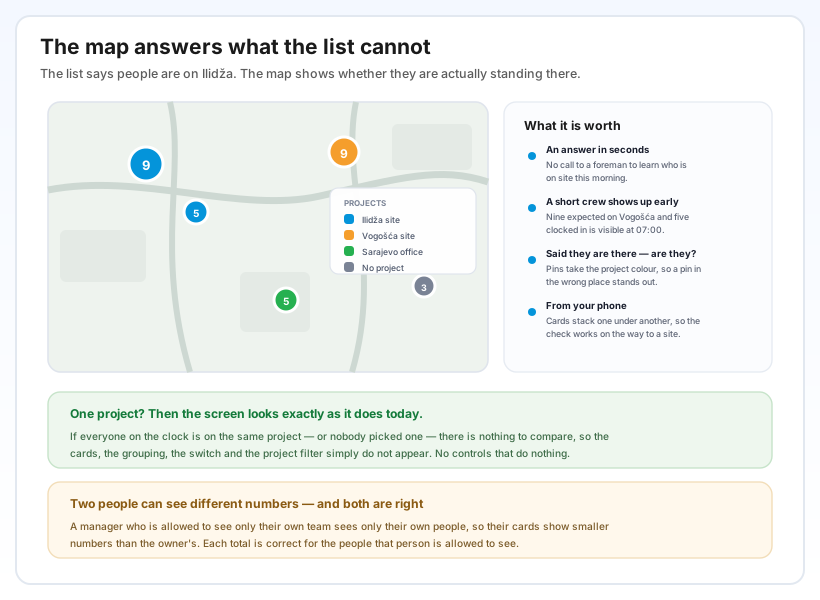
The morning question is answered on screen. Nine people expected on one site and five clocked in is something you can see at 07:00, while the day can still be rearranged — not at the end of the week.
The map says whether they are actually there. On the map tab the pins take the colour of the project, with a legend beside them, so a pin sitting far away from the rest of its colour stands out without anyone hunting for it.
It works from a phone. This is a check people make on the way to a site, not at a desk, so on a narrow screen the cards stack one under another and the people who are on the clock come first.
And when there is nothing to compare, nothing appears. If everyone is on the same project — or nobody picked one — the cards, the grouping, the switch and the project filter all stay hidden, and the screen looks exactly as it does today. No controls that do nothing.