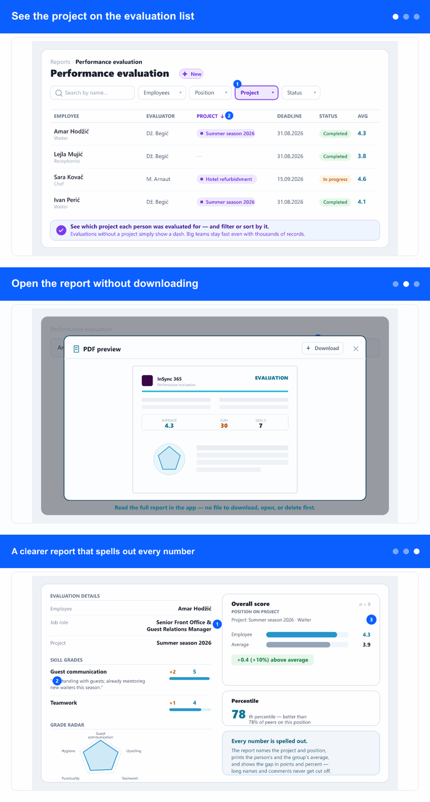
See the project on the evaluation list
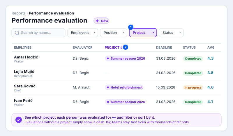
The Performance evaluation list gains a Project column, so you can see at a glance which project each evaluation belongs to. Evaluations that aren't tied to a project simply show a dash. You can sort by the Project column and there's a new Project filter in the filter bar — pick one or more projects and the list narrows to them, alongside your other filters and the name search.
Behind the scenes the list was reworked so it stays fast even for companies with thousands of evaluations — searching, sorting, filtering and paging all happen on the server, so large teams no longer wait for the whole history to load.
Open the report without downloading
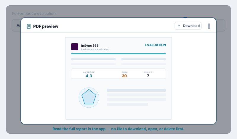
Next to the PDF download icon in each row there's now a preview (eye) button. Click it and the same report opens in a wide viewer right inside the app — no need to download a file, find it, open it and delete it afterwards just to take a quick look. From the viewer you can still Download the PDF if you want to keep or sign it, and closing the viewer returns you to the list exactly where you were.
The preview follows the same rule as download: it's available once an evaluation is completed, and it's shown but greyed out (with an explanation) until then.
A clearer report that spells out every number
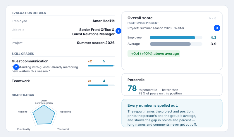
The printed report reads more cleanly:
Long values wrap instead of overlapping. A long job title (or any header value) now flows onto a second line instead of running over its label, so the header always stays legible.
Comments appear under each grade. If the evaluator wrote a note next to a skill, that comment is now printed under the item (wrapping if it's long) — the context behind a score is no longer lost.
The skill radar has room to breathe. Long, multi-word skill names now wrap onto more lines and no longer collide with each other or with the legend — the whole name is always readable.
The peer comparison is fully spelled out. The “Overall score” box now names the project and position being compared, prints the employee's average and the group's average side by side, and shows the gap both in points and as a percentage (for example, “+0.4 (+10%) above average”).
Why it helps
Evaluations are easier to organise and to explain. Seeing and filtering by project lets you review a season, a site or a campaign as a group. A quick preview saves the download-open-delete dance when you just want to check a report. And a report that spells out the project, position and every average—with nothing cut off—means the person you share it with understands it without asking follow-up questions.