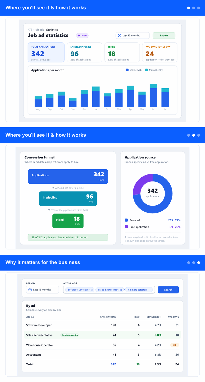
See how your job ads really perform

Added

Management, recruitment leads, and the people who run your hiring campaigns get a brand-new Job ad statistics screen in the ATS area—the first recruitment report in InSync 365. See, on one screen, how many people applied, where they came from, how many entered your pipeline and were hired, and how long it takes from application to first working day—for a chosen period and for the ads you pick.

Overview: open Job ad statistics, read the headline numbers and applications-per-month chart, follow the conversion funnel from applications to hires and the source split, then compare every ad in one table.
One screen · applications, sources, hires, and time-to-hire per ad

Where you'll see it & how it works
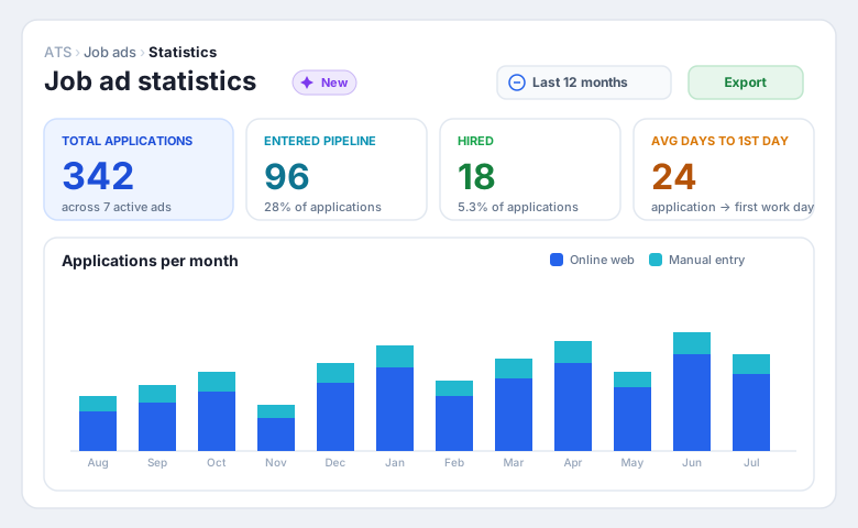
Job ad statistics dashboard: a New chip, a Last 12 months period, four headline cards — total applications, entered pipeline, hired, and average days to first working day — and an applications-per-month chart split into online and manual entries.
Headline numbers up top · applications per month split by source

Open the ATS area and choose Job ad statistics. The screen opens on the last 12 months with all your active ads selected. Along the top, headline cards give you the numbers everyone asks for—total applications, how many entered the pipeline, how many were hired, and the average days from application to first working day. Below them, a month-by-month chart shows the flow of applications and whether they arrived online or were entered manually. Change the period with a preset or a custom range, or narrow to specific ads, and every card and chart refreshes together.
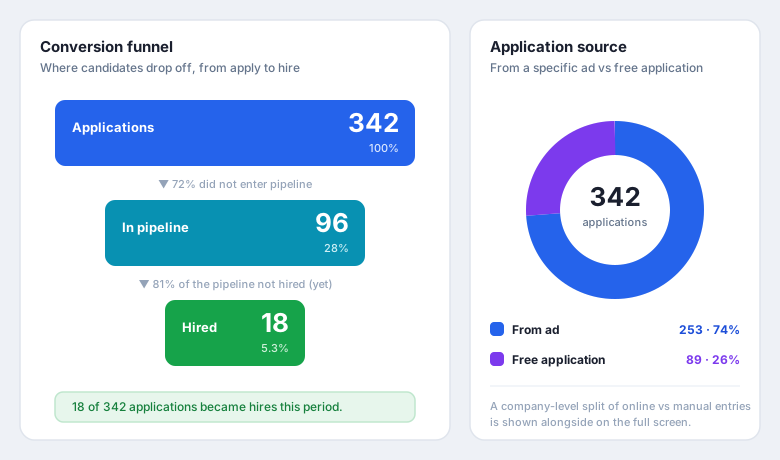
A conversion funnel from applications to pipeline to hires with drop-off percentages, next to a donut splitting applications into from-ad versus free application.
Follow the funnel from apply to hire · see where applications come from

A conversion funnel makes the whole journey obvious: of all the applications, how many made it into your pipeline, and how many became actual hires—with the drop-off at each step. Because a hire is counted when a candidate is converted into an employee, the numbers stay honest no matter what you call your pipeline stages. Alongside, a source breakdown shows how many people came in from a specific ad versus a free (general) application, so you can see how much of your intake the ads are really driving.

Why it matters for the business
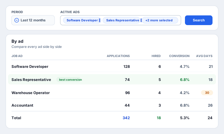
A per-ad table comparing applications, hires, conversion rate and average days to first working day for each job ad, with the best conversion and the slowest ad highlighted.
Compare every ad side by side · spot the best and the slowest

Until now the ATS had no reporting at all—judging whether an ad was worth running meant counting by hand. Now every ad sits in one table: applications, hires, conversion rate, and average days to first working day, side by side. You can see at a glance which ad brings the most qualified people, which one is slow to fill, and where to spend the next campaign budget.

For management it is a straight answer to “is our hiring working?”; for recruitment leads it turns a gut feeling into numbers you can act on—retire an underperforming ad, double down on the channel that converts, and set realistic time-to-hire expectations. The whole report follows your chosen period and ad selection, so you can review a quarter, a campaign, or a single vacancy.

The screen is part of the ATS module and shows only your own company's ads, candidates and employees. “Average days to first working day” needs the employment start date from the HR/ADM records; where that isn't kept, that single figure shows as unavailable while the rest of the report works normally. The online-versus-manual source split is shown at company level; the primary per-ad source split is from-ad versus free application.